
Luby — Website
%201.png)
Study
Introduction
About
Luby is a custom-made software house delivering world-class tech solutions in Brazil and abroad for 20 years now, from designing a solution from scratch to the complete refactoring of any existing software product.
The company has a great portfolio of successful cases and happy clients to brag about, but as the company grew, its services became more specific as they discovered the best seas for them to sail. For most of the team, tech language is a part of their daily life and they don’t realize how some ways of explaining processes could sound like greek to some — luckily, designers were there to notice it.
Through traffic stats, we were able to identify that the website had a big number of accesses, but a low conversion rate, which made us suppose that the information of architecture was not clear, and there were many terms and copies that would hardly make sense to someone not much into the tech field — which is the case of most of the target audience.
Process
My role
Besides my lead, I was the only product designer in charge of the project. I gathered information with the stakeholders, conducted most of the discovery methodologies and created and presented user flows, wireframes and high-fidelity prototypes.

Discovery
CSD Matrix
An usual first step on every project, the documentation of certainties, suppositions and doubts is an insightful way of gathering most of the information we’ll be needing in the further steps.
This method helped us on taking the right questions to the meetings with stakeholders, as well to confirm our guesses.
The matrix is fluid: as we confirm our suppositions and doubts, they become certainties. The following image, therefore, shows only how it was in the middle of the process.

Lean Canvas
Lean Canvas is a schematic chart that provides a great understanding of the business model in a visual, direct and lean way. Here we define the problem, solution, metrics, value proposition, competitive advantage, channels and clients, always trying to be as concise and precise as possible. The value proposition is a key insight: it should be a sentence that defines our entire mission.
Problem
- Users are not finding what they need on the website
- The conversion rate is lower than expected
- Pages are taking too long to load
Solution
- Create an intuitive website in which its target audience can easily find what they are looking for and understand Luby’s processes work
- Create a website that conveys value and trust and inspires the user to get in touch through the form
- Optimize the website so that loading time is reduced
Metrics
- Access rate
- Form filling rate
- Contract closing rate
Competitive advantage
- End-to-end digital solutions performed by exceptional teams
Channels
- Website
Clients
- Papaya, Usend, Safraplay, Foxtrot, DCI, Cartos, Lubrin, Vicaton, Datora, LexisNexis, Nexus, BeepBeep, Resale, UH, Sunwest Bank
Value proposition
Create a website that conveys value and trust and inspires the user to get in touch through the form.

Competitors analysis
Competitive analysis helps us learn the ins and outs of how our competition works, and identify potential opportunities where we can outperform them. Since we need to use a little sensitive data on this methodology, I’ll be sharing a model that represents exactly how we got it done only.

User journey
A user journey is a path a user may take to reach their goal when using a particular website. We use it to identify the different ways to enable the user to achieve their goal as quickly and easily as possible.
On this methodology, we noticed two very important points for consideration so the user has a much higher chance to take the desired path: That they find answers to their questions as quickly and intuitively as possible, and that the experience of filling out the contact form is concise and objective. We need to break it into steps, have a progress indicator and make it more visually explanatory.

Definition
Information architecture
After checking dozens of competitors and getting to know well the company's services and what we needed to sell, it was time to define the information architecture. We projected the flowcharts and went for adapting it to fulfill every stakeholder need through many meetings — but also always trying to slow them down when it was needed, as we didn’t want the website to feel crowded and hard to understand to the user and end up with the same problem.
Solutions
Since Luby provides a large number of services, all related to tech solutions for businesses, the idea here is that we would have one page focused on each target group’s pains. Since most of them access the website looking for a group of solutions designed for their situation instead of a specific tech service, it should be the first thing on the menu. On startups, we would have all kinds of solutions for those who need a concept executed quickly. On digital transformation, we would focus on huge and traditional organizations that are going — or want to go — through digital transformation, whether to raise their income or to improve their processes. On team augmentation, we would contemplate the big techs that need a skilled team to execute their needs for the short or long term.
Services
All provided services, listed on a complete and technical way, if you need. But instead of the old website that had like 15 services that only a senior dev would understand, we summarized everything on 4 main groups: Software development, Product design, Team as service and Games.
Cases
Here, Luby’s clients and the excellence of their work are the focus. App screens, testimonies, client’s logos and all that stuff.
Luby
A page focused on telling Luby’s history and endorsing the company's trust among both clients and employees.
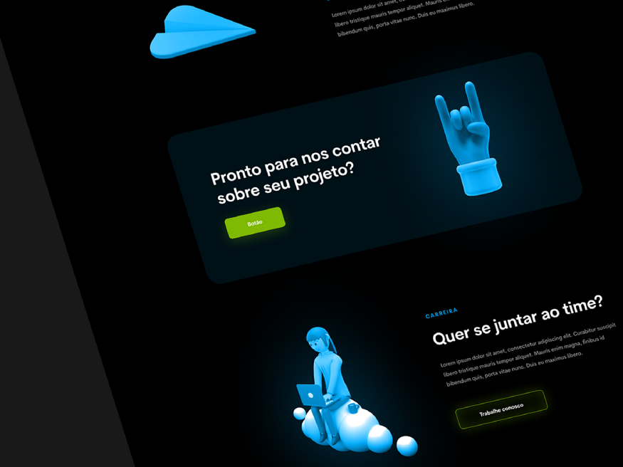
Career
Pages that redirect you directly to applications for open positions and intern programs.
Contact us
The contact form, where we expect to bring the users after they gathered all the information they needed. There should be a button in the menu constantly, and also on the CTA’s boxes at the bottom of most pages.

Wireframes
In order to save time prototyping, only the wireframe of the homepage was designed, since we considered that on this project, it would define well enough the components and styles for us to move forward directly to high-fidelity designs on the following pages, without costing the rework we could have if we had stepped into high-fidelity right away.

Styleguide
First of all, the global components and styles were defined. As the project moved forward, new components were designed according to our needs.


Final results
Header
I created the header using a 3d illustration from the illustration family we chose to use on the website, but it could be the place of videos and more interactive content in the future.

Ready to tell us about your project?
Call-to-action boxes have been spread all around. Usually, after every content, there’s one call to the user to contact Luby to talk about a project or a call to check the open positions, depending on whether the page’s target is employees or companies.
Good reputation
To affirm Luby’s authority in the field, the cases page has many clients' testimonies, logos and success cases.

History
A very different, interactive and mysterious timeline was designed, to tell the user a little bit about Luby’s 20 years of history.

List of services
As we discussed earlier, we need to make everything easy peasy for the target to understand the complexity of Luby’s processes. That’s why the services are explained briefly and always with visual support. From that, you can click on “read more” and get all the technical information you need, if you’re more into tech or just want to understand more deeply.

Contact us
As defined before, the form now has been divided into steps, has a progress bar and much more visual support. That not only makes it way more attractive to keep filling to the user, but it gives Luby the possibility to collect data even when the user gives up.
In fact, Jakob Nielsen describes how much this element is important in UX in the very first of Nielsen’s Heuristics:
#1: Visibility of system status
The design should always keep users informed about what is going on, through appropriate feedback within a reasonable amount of time.
.gif)
Conclusion
This was the first project in which I had the chance to perform an entire discovery process in a structured way, and it was an enriching experience for my career. I was also lucky to have a great design lead during the project who guided me through everything I needed and a multidisciplinary amazing team that was always there for me. Hope you liked it!
If you’d like to follow me on my journey a little bit, feel free to connect with me on LinkedIn, Behance, Dribbble and Instagram.
References
Below, you can check the full UI project.


